Why Imperfect Handcrafted Packaging Design Is Replacing Minimalism
Posted on
Uncategory
Posted at

Open any shelf today and you will spot it. Coffee bags with hand stamped logos. Skincare boxes wrapped in rough kraft paper. Candles tied with real twine instead of a printed ribbon graphic. This shift explains why handcrafted packaging design is turning up everywhere from small coffee roasters to big skincare brands.
What Handcrafted Packaging Design Really Means
This style is not sloppy work. It is packaging made to look like a real person touched it. A label that sits a little off center. Ink that bleeds slightly into the paper. A box folded by hand instead of a machine.
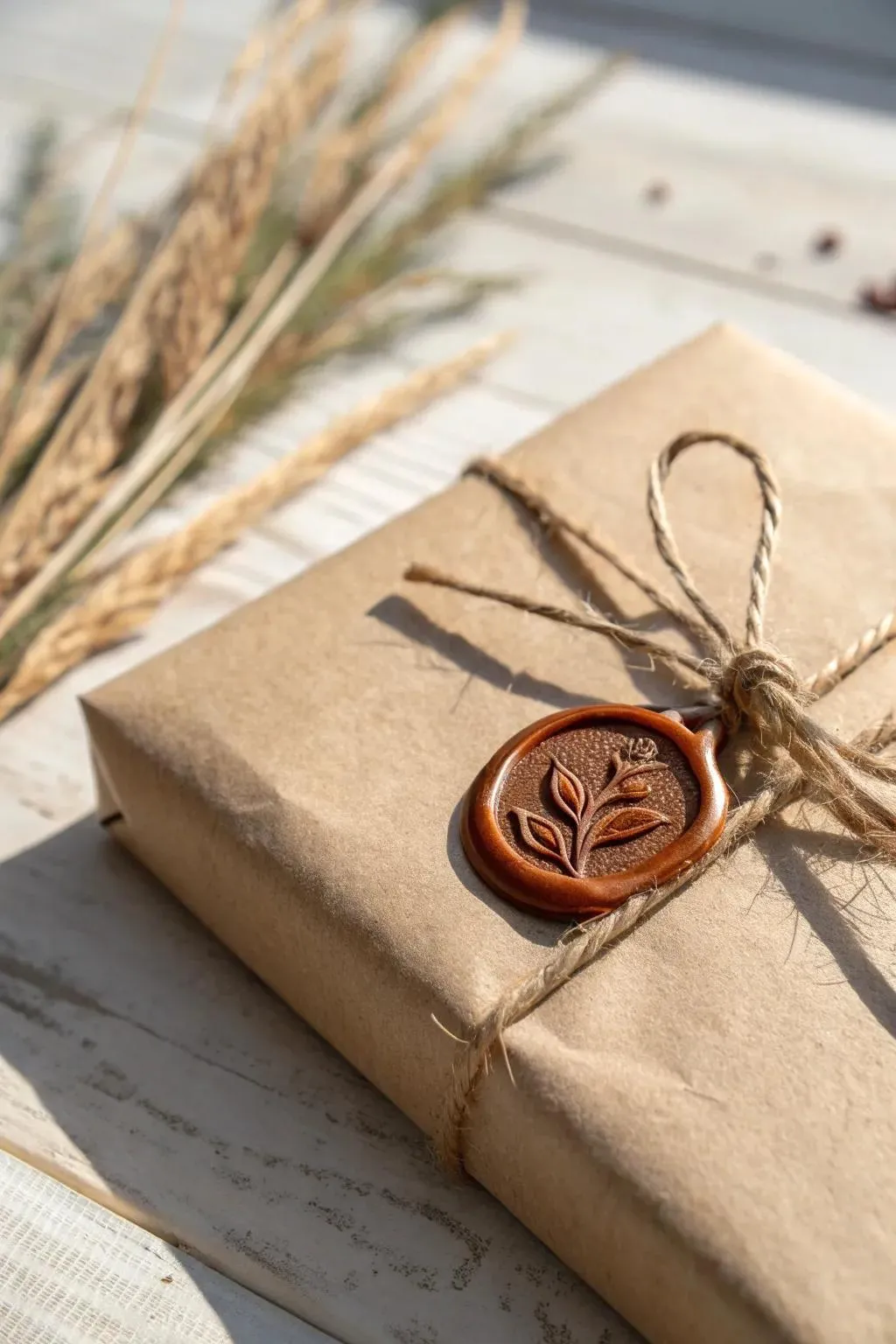
The materials matter too. Kraft paper, wood, cloth, and twine all carry a natural warmth that plastic and glossy print cannot copy. Small marks like torn edges or hand numbered batches are part of the plan, not a mistake to fix.
Designers now call this the tactile craft look. It shows up in embroidery style stitching on labels, felt textures on boxes, and paper cuts used as decoration. The goal is always the same. Make the package feel like an object someone shaped with care, not one that rolled off a line untouched by a human hand.
Why Perfect Minimal Boxes Feel Cold Right Now
AI tools can now build a flawless logo or box design in minutes. That sounds great until every brand on the shelf starts to look the same. People scroll past hundreds of perfect digital images a day, so perfect has quietly started to feel fake and forgettable.
A design that looks like a human truly made it grabs attention faster simply because it stands apart from that flood of polished sameness.
Human craft is becoming a real point of difference for brands trying to stand out from a wave of AI made visuals. Insight from Lily Andrews, designer at Lotiva
Real Brands Already Winning With This Rough Look
This is not just a mood board idea. Real brands are already selling more because of it.
Liquid Death cans mountain water in dark metal tins that look more like a rock concert poster than bottled water, and the bold messy design makes people stop and look twice.
Death Wish Coffee ships matte black kraft bags with a hand stamped skull that looks a little different on every bag, plus a red wax seal and a handwritten roast date on each one.
Neither brand is small or new to the market. Both are proof that a rough handmade look can work at real scale.
Why Shoppers Trust A Handmade Feel More
People trust what feels real. A rough edge or an uneven stamp quietly signals that a real person cared enough to make it by hand, and that feeling builds trust faster than a flawless finish ever could.
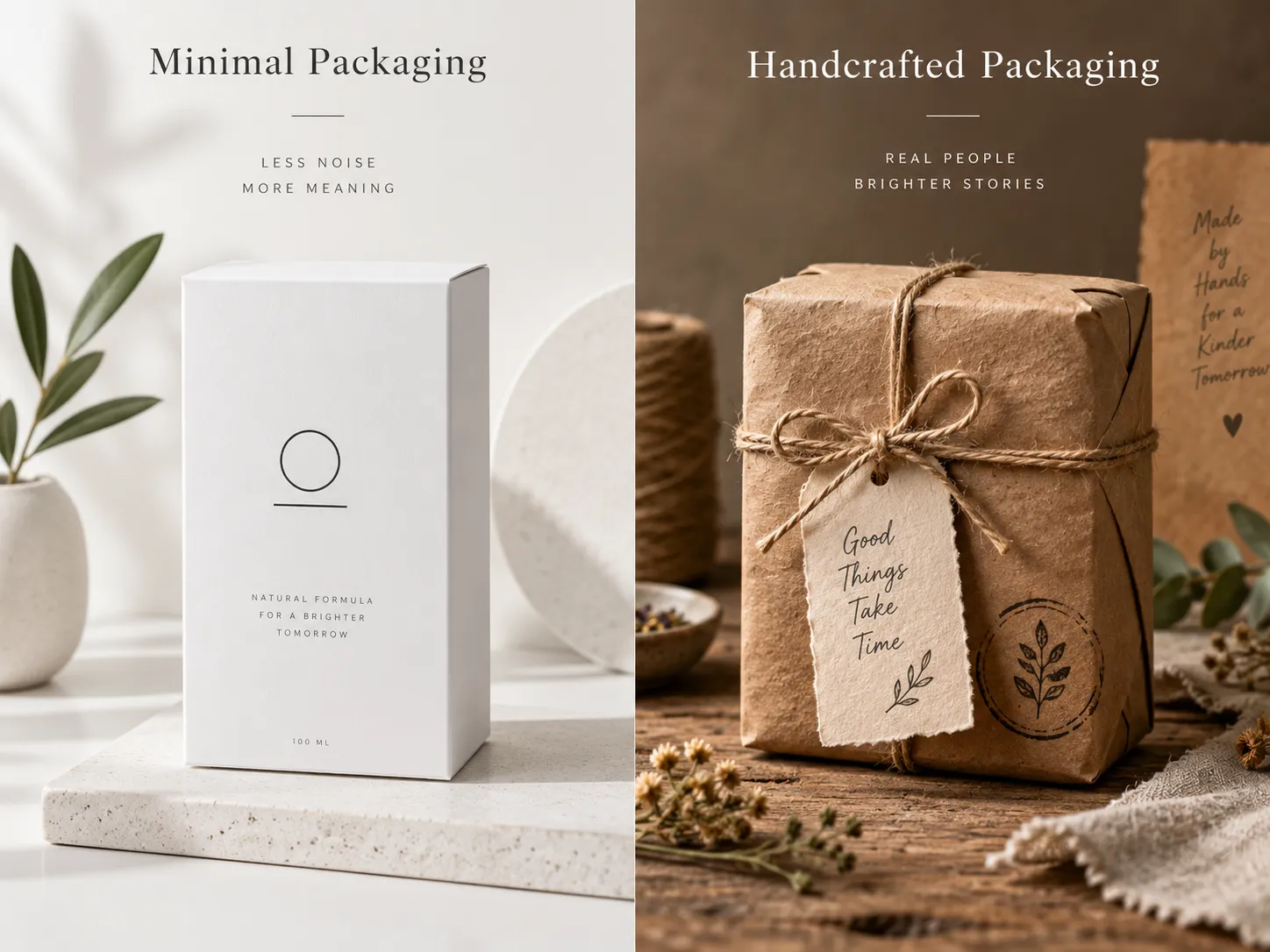
Texture plays a big part too. Kraft paper, wood, and cloth give people something to actually touch and remember long after they leave the store. A perfectly smooth box rarely sticks in memory the same way.
There is also a story angle at work. A hand stamped date or a founder note printed on the inside flap makes a shopper feel like they know who actually made the product. That small sense of connection often matters more to a first time buyer than any spec sheet or feature list ever could.
What The Latest Numbers Say About This Shift
This is not a small niche trend anymore. A 2026 design trend survey from Bigeye found that 73% of designers say they are now adding imperfect touches like uneven lines or hand drawn shapes on purpose. That means most of the design world is quietly moving in the same direction at the same time.
What To Check Before You Drop Minimal Packaging
Before switching your own packaging over, run through a short checklist first.
Product category. Food, skincare, and craft goods buyers respond strongly to a handmade look.
Printing budget. Rough finishes often cost more per unit, not less, so plan ahead.
Shelf environment. This style stands out most next to plain minimal competitors.
Brand story. This look only works if there is a real craft or origin story behind it.
Production timeline. Hand finished touches take longer to produce at scale.
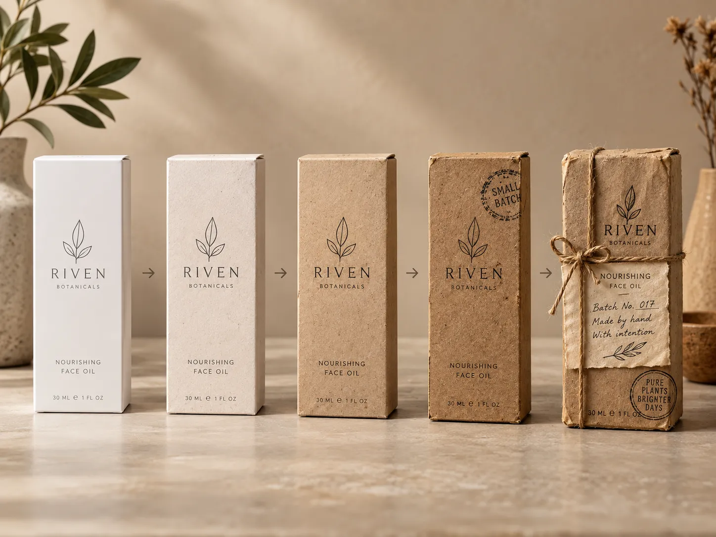
Rough Style Versus Minimal Style Side By Side
Neither style is better in every case. Here is how they actually compare.
Factor | Minimal style | Handmade style |
Shelf feel | Calm and clean | Loud and memorable |
Cost per unit | Often lower | Often higher |
Best fit | Tech and modern brands | Food, craft, and wellness brands |
Production speed | Fast and consistent | Slower but more unique |
Trust signal | Feels professional | Feels personal |
Common Questions About This Packaging Trend
Does handmade packaging cost more to produce? Usually yes. Hand finished touches like stamps or wax seals take more time per unit than a printed minimal design.
Is this trend only for small or craft brands? No. Larger brands like Liquid Death also use a rough handmade style on purpose to stand out from more polished competitors.
Will minimal packaging disappear completely? No. Minimal design still works well for tech and premium brands that want to feel clean and modern on the shelf.
How do I try this without a full redesign? Start small. A hand stamped sticker or a kraft paper label can test the look before a full packaging overhaul.
Does this style work for online stores, not just shelves? Yes. Unboxing videos and product photos both favor a handmade look because texture and small imperfections still read clearly on camera, unlike a plain glossy box that can look flat on screen.
Should Your Brand Make The Switch Now
There is no single right answer here. The real question is whether your product has a story worth showing by hand. A brand that already leans on craft, origin, or care can build trust fast with this look. A brand that sells on speed or precision may still do better with a clean minimal design. Packaging design is not just paper and ink. It is the first thing a customer touches before they even try what is inside. At U and I Resources Private Limited we help Surat brands and businesses across India shape that first impression the right way. That might mean leaning into a handcrafted feel. It might also mean keeping things clean and minimal.
Our team works closely with founders to build packaging and branding that actually matches what a business stands for and not just what looks nice on a shelf.
If your packaging still looks like everyone else's. It might be time for a real conversation. Reach out to U and I Resources Private Limited and let your brand look and feel like nobody else's.